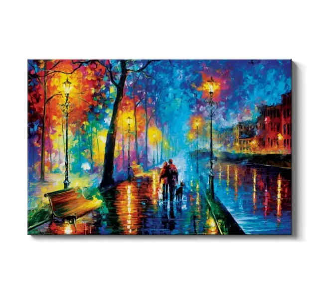
Wall art can change the emotional temperature of a room long before anyone studies its subject matter closely. Leonid Afremov’s paintings are particularly effective at creating that immediate reaction because they rely on intense color, visible texture, luminous contrasts, and recognizable scenes transformed through an expressive visual language. His rain-covered streets, tree-lined walkways, city evenings, and solitary figures rarely function as quiet background images. Instead, they introduce movement and atmosphere into spaces that might otherwise feel visually restrained. A room with neutral walls and practical furnishings can acquire a markedly different personality when one of his compositions becomes the focal point. That capacity to alter mood helps explain why Afremov-inspired wall decor can feel unusually energetic without depending on complicated subject matter.
Much of that energy comes from the tension between familiarity and exaggeration. Viewers recognize parks, umbrellas, streetlights, buildings, bridges, reflections, and autumn trees, yet Afremov renders them with colors that are more intense than everyday observation would usually provide. Orange may burn against deep blue, yellow light may scatter across a wet pavement, and red foliage may glow beside purple shadows. The scenes remain accessible because the visual structure is understandable, but the heightened palette pushes them beyond straightforward representation. In an interior, this combination is useful because the artwork can command attention without becoming obscure or conceptually distant. It offers homeowners a dramatic visual statement while retaining the emotional accessibility of landscape and city imagery.
That distinction matters when art is being selected for a living room, bedroom, dining area, hallway, or office. Decorative art must coexist with furniture, lighting, architecture, and daily activity rather than being viewed under gallery conditions. Afremov’s compositions often succeed in that context because they provide strong focal points from across a room while also offering smaller details that reward closer viewing. The eye may first register a field of saturated color, then notice individual streaks of reflected light or thick blocks of pigment. This layered experience keeps a work visually active even after it has become familiar. Rather than simply filling an empty wall, the image can become part of the room’s continuing atmosphere.
Color as a Source of Visual Energy
Color is the most immediate feature of Afremov’s visual language, and it is central to the way his work affects wall decor. He frequently placed warm oranges, yellows, reds, and pinks beside cooler blues, violets, greens, and dark shadows, creating high levels of chromatic contrast. These juxtapositions prevent the surface from appearing passive because the colors seem to press against one another. Warm tones appear to advance while cooler areas create depth, producing a sense of movement even when the depicted scene itself is still. In a room, that interaction can enliven large stretches of plain wall and introduce visual rhythm without changing the architecture. The result is a focal point that feels active from several viewing distances.
Afremov’s palette can also connect otherwise unrelated colors already present in an interior. A painting containing amber streetlights, cobalt shadows, crimson leaves, and green reflections may pick up individual tones found in upholstery, rugs, books, ceramics, cushions, or decorative objects. That does not mean the artwork has to match the room exactly. In many cases, a slightly unexpected color relationship is what prevents a space from looking overly coordinated or staged. The painting can serve as a bridge between neutral foundations and stronger accent colors, giving the overall scheme greater coherence. Once color has been considered, the next practical question is how the artwork’s scale, surface, and presentation will affect that same visual relationship in the finished room.
Those considerations become especially relevant when Afremov’s work is reproduced for residential wall display, since size, material, and finish can subtly change the presence of an image. The growing range of reproduction options also makes it easier to see how presentation influences the way color and light are experienced in a room. Marketplaces such as iCanvas bring together ready-to-hang artwork from independent artists, licensed estates, and cultural institutions across canvas, fine art paper, acrylic glass, wood, and metal. Its collection of Leonid Afremov wall art provides a useful example of how vivid color, luminous reflections, and expressive city scenes can take on different qualities depending on scale and surface. The practical question is not simply whether an image is colorful, but how that color will behave within the room. Concentrated reds can create greater visual intensity, while blue reflections and yellow streetlights may establish a cooler, more atmospheric balance. Seen this way, color becomes part of the interior design rather than a decorative afterthought.
Light, Rain, and Reflections Create Atmospheric Depth
Afremov’s paintings frequently use light as something more tangible than illumination. Streetlamps, windows, sunset tones, and reflected highlights often appear as concentrated areas of yellow, white, orange, or red surrounded by darker blues and purples. That contrast creates the sensation that light is emerging from inside the painting rather than merely resting on its surface. When reproduced effectively as wall decor, the effect can add visual warmth to rooms that receive limited natural light. The image does not literally brighten the space, but its luminous structure can make the wall feel less flat and visually heavier areas feel more balanced. This is one reason his nighttime and rainy scenes can feel energetic rather than somber.
Wet streets are particularly important in Afremov’s compositions because they allow color to appear twice, first in the apparent source and again in its reflection. A row of lamps may produce elongated streaks of yellow and orange across the pavement, while trees and buildings dissolve into broken patches of blue, red, and violet below. These reflections create a strong vertical rhythm that guides the eye through the scene. They also suggest motion because the colors seem fragmented, as if changing with every ripple or uneven surface. On a wall, these repeated lines can make a composition feel larger and more spatially complex than its physical dimensions suggest. The artwork therefore contributes depth as well as color.
Rain also introduces an emotional quality that distinguishes these scenes from conventional bright landscapes. Rainy settings can imply solitude, memory, intimacy, transition, or quiet observation, yet Afremov’s brilliant palette keeps them from becoming visually bleak. That combination gives the work emotional complexity because the subject may suggest introspection while the colors remain celebratory. Such tension can be especially effective in bedrooms, reading spaces, entryways, and living rooms where owners want atmosphere without heaviness. A painting can feel reflective without looking dull, or romantic without becoming delicate. The decor gains emotional depth because several moods can coexist within the same image.
Palette-Knife Texture Gives the Artwork a Sense of Motion
Texture is another reason Afremov’s style produces such a strong decorative presence. He became closely associated with palette-knife painting, a technique that can create distinct areas of pigment with sharply defined edges, layered surfaces, and visible changes in direction. Instead of smoothing every transition, this approach allows individual marks to remain part of the finished image. The result is a surface that appears constructed from numerous pieces of color. Even in reproduction, the visual evidence of those marks can give the image a tactile quality. Viewers perceive not only a scene but also the physical act of building it.
These block-like and sweeping marks contribute to the impression of motion. Tree branches appear to flicker because they are assembled from separate bursts of color, while reflections seem to vibrate because adjacent strokes do not blend into a uniform surface. Roads, skies, and foliage can contain multiple directions of movement at once. That complexity keeps the viewer’s eye circulating through the composition rather than settling in one place. In decorative terms, this makes the image useful where a room needs animation or a stronger visual pulse. A broad, minimally decorated wall can feel substantially more dynamic when covered by a composition containing hundreds of implied gestures.
Texture also changes the relationship between figurative subject matter and abstraction. From several feet away, viewers may clearly see a couple walking beneath an umbrella or a path receding through trees. At close range, those recognizable objects break apart into pieces of color, edge, and directional mark. This dual identity allows Afremov’s work to function with both traditional and contemporary interiors. Someone attracted to representational scenes can respond to the recognizable setting, while someone interested in expressive painting can focus on color and surface. That flexibility gives the work broader decorative range than a strictly literal landscape might have.
Emotion Comes From the Contrast Between Warmth and Solitude
The emotional appeal of Afremov’s work often depends on contrast rather than on a single obvious mood. Many scenes contain solitary figures, nearly empty streets, dark skies, or rain, all of which could suggest quietness or melancholy. At the same time, these elements are surrounded by unusually warm colors, glowing lights, and vivid reflections. The coexistence of solitude and visual abundance creates an emotional tension that can hold attention longer than a straightforwardly cheerful or somber image. Viewers are given room to interpret the scene according to their own associations. That openness is important in wall decor because art remains present through changing moods and circumstances.
Figures carrying umbrellas are a useful example of this effect. They are often small relative to the surrounding environment, which can emphasize the scale of the street, park, or avenue around them. Yet their presence introduces human narrative into what might otherwise be a purely decorative landscape. A viewer may imagine companionship, a private conversation, a walk home, or a fleeting encounter without being given a fixed storyline. This makes the scene emotionally suggestive without becoming overly specific. In a home, that ambiguity allows the painting to remain personal even when many people encounter it.
The intensity of the palette also keeps introspective scenes from feeling visually withdrawn. Bright orange can suggest warmth and immediacy, while deep blue can bring calm, distance, or nighttime atmosphere. When those hues are placed together, the viewer experiences both activation and quiet. That is a useful combination for rooms where people want character but not visual aggression. The painting contributes energy through color while the subject contributes emotional restraint. In effect, the artwork can make a room feel expressive without making it feel chaotic.
Choosing the Right Room for Afremov-Inspired Wall Art
Placement has a significant effect on how this style is experienced. In a living room, a large Afremov-inspired composition can work as the dominant visual element above a sofa, console, or fireplace, especially when the surrounding furnishings are relatively simple. The artwork’s strong palette gives the eye an obvious destination, which can help organize an otherwise open space. Neutral walls in white, cream, soft gray, or muted beige often create enough contrast for saturated colors to appear especially vivid. Darker walls can also work, but the relationship becomes more theatrical and may emphasize the luminous portions of the image. The choice should depend on whether the goal is crisp contrast, enveloping atmosphere, or something between the two.
Bedrooms require a slightly different approach because visual intensity should support rather than overwhelm the room’s restful function. Compositions dominated by deep blues, violets, soft golds, or quieter evening scenes may provide the emotional richness associated with Afremov while maintaining a more settled atmosphere. Placement behind the bed can create a dramatic anchor, while a smaller work across from the bed can introduce color without dominating the entire room. Bedding does not need to reproduce every color in the painting. Repeating one or two secondary tones through cushions, throws, or bedside accessories is often enough to establish continuity. This approach allows the artwork to remain the strongest visual element instead of turning the room into an exact color match.
Dining rooms, offices, entryways, and hallways offer additional opportunities because they can accommodate stronger visual statements. A dining area may benefit from warmer reds and oranges that add richness to evening settings, while an office can use a highly textured cityscape to bring energy to a practical environment. Entryways are particularly suitable for dramatic pieces because they establish an immediate impression when someone enters the home. Hallways can benefit from vertical compositions or a coordinated sequence of smaller works that creates rhythm along the passage. In each case, the best placement considers sightlines, wall dimensions, available lighting, and the visual competition from nearby objects. The artwork should feel intentionally integrated rather than simply occupying unused space.
Scale and Material Can Change the Decorative Effect
A painting’s imagery is only one part of its impact as wall decor. Scale can dramatically alter how Afremov’s dense color and texture are perceived. A smaller print may function as an accent that rewards close inspection, while an oversized version can transform the same scene into an immersive field of color. Large works allow the individual strokes, reflections, and contrasting hues to become more prominent across the viewer’s field of vision. This can be especially effective above wide furniture or on tall, uninterrupted walls. Smaller works, by contrast, can be grouped with other pieces or used to introduce color in tighter spaces.
The printing surface also influences the character of the image. Canvas can reinforce the association with painting because its texture and depth provide a more object-like presence on the wall. Fine art paper may emphasize sharp detail and color relationships while offering a flatter, more graphic presentation when framed. Acrylic surfaces can intensify perceived brightness and contrast, which may complement compositions built around reflections and artificial light. Metal can create another contemporary interpretation by emphasizing clarity and surface sheen. No material automatically suits every room, so the surrounding furniture, lighting, architectural style, and desired level of formality should guide the selection.
Lighting deserves equal attention because highly saturated artwork can change noticeably under different conditions. Warm household bulbs may strengthen oranges, reds, and yellows, creating an especially inviting evening effect. Cooler light can make blues and purples appear more prominent and may produce a crisper overall impression. Direct glare should generally be considered when positioning glossy surfaces, particularly across from windows or strong fixtures. Adjustable picture lighting can help reveal details and maintain a consistent appearance after sunset. Good placement allows the work’s built-in sense of illumination to remain visible without relying on excessive brightness in the room itself.
Using Afremov’s Style Without Overloading the Space
Because Afremov’s visual language is intense, restraint elsewhere in the room can make the artwork more effective. A common mistake with colorful art is to repeat too many of its hues throughout the interior, creating a space in which every object competes for attention. A more disciplined approach is to let the painting establish the broad color story and then select only a few tones for repetition. A blue from the shadows might appear in a cushion, while a warm amber might be echoed in a lamp or small ceramic object. The remaining furniture can stay comparatively neutral. This creates visual connection without reducing the painting to a decorating template.
The same principle applies to surrounding wall decor. Placing several equally vivid pieces too close together can weaken the impact of each one because the eye has no clear hierarchy. A single large Afremov work may need generous negative space around it, especially if the composition contains many colors and dense texture. Gallery walls can still work, but they benefit from consistent spacing, deliberate sizing, and a clear relationship among the pieces. Simpler neighboring artworks can create balance by giving the most expressive composition room to dominate. Effective display is often less about adding more objects and more about controlling the relationships among them.
Furniture form can provide another kind of balance. Clean-lined sofas, simple tables, restrained shelving, and solid-color upholstery can serve as calm structural elements around a visually energetic painting. In more traditional interiors, the contrast between expressive color and classic furniture can produce a layered, collected appearance rather than a strictly contemporary one. The key is to avoid forcing the entire room into the stylistic identity of the artwork. Afremov’s imagery can be the expressive component within a broader decorative scheme instead of becoming the scheme itself. That approach gives the interior greater longevity because furnishings can evolve without requiring the artwork to be replaced.
Why the Style Can Remain Compelling Over Time
Strong decorative art must do more than create an immediate impression. It must continue offering something after the novelty of a new purchase has faded. Afremov’s style has an advantage in this respect because it operates on several visual levels simultaneously. Color creates the first impact, subject matter provides familiarity, reflections create spatial depth, and textured marks encourage closer observation. Different features may become more noticeable at different times of day or from different places in the room. That variety gives the image a better chance of remaining visually engaging over long periods.
The emotional ambiguity of the scenes also contributes to their staying power. A rainy avenue can feel romantic one day and contemplative another, while an autumn park may suggest excitement, nostalgia, warmth, or change depending on the viewer’s mood. Art with a narrowly defined message can sometimes become predictable once that message is understood. Afremov’s work tends to leave more interpretive space because the narrative is suggested rather than fully explained. The setting may be specific enough to invite recognition but open enough to accommodate personal associations. For wall decor, that combination can make the artwork feel less like a temporary accent and more like an enduring part of the interior.
Ultimately, Afremov’s contribution to wall decor lies in his ability to combine decorative intensity with emotional accessibility. His colors can energize restrained interiors, his reflections can create depth, and his textured marks can introduce movement to static walls. At the same time, familiar streets, trees, lamps, couples, and rain give viewers an immediate point of emotional entry. The style does not ask a room to become a gallery in order for the art to work. It asks only for enough visual space to let color, light, texture, and atmosphere interact. When those elements are thoughtfully placed, Afremov-inspired wall art can turn an ordinary surface into one of the most emotionally expressive parts of a room.